6 Things that make or break your Website

 Have you ever heard about the saying: “The devil is in the details”?

I bet you did.

When it comes to building a website, this quote still remain true. It can take weeks to finish, cost a fortune, and there are still at least half a dozen considerations that we didn’t fully think through before work gets started. And then, at the end of the day it’s those smallest things that make or break our website.

Even though every designer might have their different plans, there are items that they should (and shouldn’t) be doing during their website design process.

So today I want to go over 6 things you need to keep an eyes on if you don’t want to send your visitors to your competitors’ sites. Be vigilant!

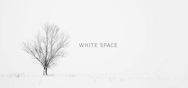
Make proper use of white space

Just because there is white space doesn’t mean you have to cram a bunch of shit in there

Do you like being yelled? No one does! That’s actually a “stuff all you can” website does to visitors! You don’t want to clutter up your website to the point that scares everyone away, do you? Visitors will be very overwhelmed if you cover every inch of your site with haphazard content. So, please leave your site some space to breath!

Also, 2017 is about minimalism and simplicity. It’s a must to incorporating white space into your website for a cleaner look overall and helping visitors to recognize what the most important information you want them to know is.

Bad photos can kill your website

A picture is worth a thousand words. They can help you attract visitors, grab their interest and keep them stay on your website.

Then, imagine if the first thing potential visitors see when they reach your site is unprofessional photos, they’re probably going to click back button without regret. Okay, you might be an expert in your field, but if your photography doesn’t reflect that, no one will stick around long enough to find out.

Don’t spend thousands of dollars on a website design and then ruin it with photos that don’t match your brand, or poor quality photos.

Do not complicate your website’s navigation

Imagine what will happen if you walk for hours in the forest without a compass or a map? It feel daunting, doesn’t it? The same can be said as a website with a confusing navigation.

Check out: Is Your Website’s Navigation Perfect?

I do not know about you, but nothing drives me nuts more than accessing a website that I cannot know what to expect clicking a link, or how to easily find what I am looking for.

So please do your visitors a favor. Make your website’s navigation prominent and legible for them to easily understand from the first moment they arrives at your website.

At a glance, visitors should know they are at the right place and how to get to where they want to be. For instance, the main menu should be designed to contrast against everything else so that your visitor’s eyes can be easily drawn to it.

Remember, people want convenience, not a challenge. The easier it is for people to use and navigate throughout your site, the longer they are likely to interact with it.

Your website isn’t mobile-optimized

As I mentioned very bluntly in every blogpost before, it’s a must for any kind of business to have a website that is responsive.

How about you try this (you’d be surprised how many business owners have never done this) – browse your own site on your smartphone or tablet. Then, what do you see? Do you have to do the “pinch and swipe” to get around your website or to read content? If that’s the case, Do you feel frustrated? That’s exactly why your visitors “eww”!

Oh dear, it’s 2017, please read 5 Compelling Reasons Your Website Should Be Responsive

It takes forever for your site to load

According to Hosting Facts, “A single second delay in your website loading time can result in a 7% loss in conversion, and 40% of web users will abandon a website if it takes longer than 3 seconds to load”.

Nobody likes waiting for so long!

There are tons of other options available out there, why would they waste their time waiting for your page to load? Is your content really worth waiting for? If they really need to visit your website then they might be a little patient, but if they’re just curious or have clicked a link on impulse then they’re more likely to leave right away.

Your website lacks personal interaction

People always want to be heard, seen or listened to. There is no doubt that if you design a website that does not include some elements or moments which user need to interact with, they won’t spend much time per their visit.

Hence, make sure your site seem more like a communication where visitors can interact than a simple portal to find information. It will be an excellent way to engage with your visitors and keep them longer in your website and gather data.

Final Words

After all, if you lack the attention to detail to take care of your own website, perspectives will feel that you are not really serious about your business. How can they purchase for your products or services?

Putting up a shoddy website is the most easiest way to scare your visitors away. Who want to do that with their business? No one!

By addressing these elements above, I hope that you can find out your own issues and improve your website’s performance.

 While your website essentially represents your business’s face, why don’t you take time to make it shine! Want help getting your website to sparkle? Talk to our team to see just what we can do for you!

Is your Website’s navigation perfect?

If you want to create a bad-ass website, navigation will be without question one of the most important aspects you should consider first.

Why do people search something on the internet? Why do they access your website? Simply, they want to get information. Navigation exists to help people find content. Navigation not only affects your conversion rate, but also your traffic and search engine rankings.

However, unfortunately, many people just take it for granted. Tons of websites out there have navigation that are poorly designed.

To step your game up a little bit, here I’ve pulled together some tips for a perfect web navigation.

Give it a shot. Why not?
Related: 7 Key Elements Of A Modern Successful Website

Make it prominent and clear

I do not know about you, but nothing drives me nuts more than accessing a website that I cannot know what to expect clicking a link, or how to easily find what I am looking for.

So please do your visitors a favor. Make your website’s navigation prominent and legible for them to easily understand from the first moment they arrives at your website.

At a glance, visitors should know they are at the right place and how to get to where they want to be. For instance, the main menu should be designed to contrast against everything else so that your visitor’s eyes can be easily drawn to it.

Keep it consistent

Your navigation should be consistent throughout the site.

Consistency makes sites easier to use, because visitors don’t have to learn new tricks as they move around. If your navigation is constantly changing from page to page, visitors will lose their on-site bearings and it will reduce quality of the user experience.

Keep it concise

I bet you’ve seen this before: that website with hundreds of links on the home page. Terrible.

Based on a study by George Miller on short term memory, designers came up with the rule that a website’s navigation should have between five and seven items. Even eight may be too many.

Having fewer items to choose from, your visitors’ eyes are less likely may scan past important items. Every time you remove a menu item, the remaining items become more prominent. Challenge yourself to limit your navigation to five items. If you are not sure which items are most important to your customers, take a look at your analytics and see which pages of your website get the most traffic.

Moreover, concise navigation is also crucial for SEO.
Related: Is Your Web Design Lowering Your Conversion Rate?

Be descriptive

Making your website navigation descriptive will save visitors the click and yes, help reduce your bounce rate for sure.

Changing the text of your menu items can prove helpful. With all the distractions on the web, it’s best to have visitors think as little as possible. They should know right away where a link will take them.

Remember, people want convenience, not a challenge. The easier it is for people to use and navigate throughout your site, the longer they are likely to interact with it.

Conclusion

Imagine what will happen if you walk for hours in the forest without a compass or a map? It feel daunting, doesn’t it? The same can be said as a website without navigation. The fact is that you cannot afford to neglect navigation if you are looking for increased traffic. So hopefully this blog post has inspired you to create more interesting navigation in your future projects.

Your turn! Do you have any tips on designing the perfect site navigation? It would be great to get your input. Feel free to share in the comments below!

5 ways to create a logo design that kicks ass

5 ways to create a logo design that kicks ass

Ranging from Facebook’s iconic sky blue F to the golden M of McDonald’s, logos that perfectly represent brand personality can instantaneously lock the audience’s memory in. How did well-recognized brands come up with such timeless icons? Who was behind them? What factors in the perfect logo? Where to find a great team of designers? Or how to create a logo on a budget? Designveloper offers you two cents on this question.

Simplicity

nike, apple, mac donald, audi, playboy
(Nike – Apple – McDonalds – Audi – Playboy)

If you are an independent business owner who is profiting from emerging e-commerce, you might want to opt for something simple. Try thinking about your first date. How you come up with a sketch of your business logo is the same way you dress to impress on your first date. Believe you and me, you would not want to be seen as putting on display, would you? Know your target audience, and dress properly. Something in your closet that you come across on a daily basis, something that screams out your personality, something that energizes you on the dullest day… Designing a brand logo is the same way you put together an outfit for a date night, or a date lunch if you are into daylight rendezvouses.

It takes 50 milliseconds for the digital audience to form an opinion about your logo which determines whether they decide to like it or not. Same as the dating game. It takes less than five seconds for someone to categorize you into a fraction. Reserved, geeky, liberal hippie, pure businessman, … the first impression truly counts. Simplicity speaks class, therefore, timeless. Standing by scads of existing logos, you need to stay true to your color- your business color aka your business service to your dear clients while standing out of the crowd.

A logo could be a letter, a text, an image, a lingo or a symbol. There is much power implied in a simple logo. It says “Cut to the chase and get down to business” with your client, which is what most of your clients would want to profess while searching for the right designers. The simplicity of your logo needs to be demonstrated on different digital platforms. If your clients’ kid can doodle your logo, you are up by half the game.

Catchy

brand logos
Visa – Shell – Disney – CocaCola – IBM

The element of catchiness not only lies in the brand advertising tunes as you might think but also lies in the spectrum of colors that are used in the creation of your logo. This means your logo cannot be hard to identify and perceive at first sight. It must be easy to recognize from afar. Imagine the internet users are fast-scrolling copious designs and your logo is one of the top 10 that pop out and can be known by sight. You are halfway there till one of the potential customers can call your logo to mind while they search for a service provider. Your logo simply has to catch attention, otherwise it would easily blend in the other thousands of designs.

Catchiness does not mean you have to the come-and-go clichés in designing. There is no certain formula in designing a logo. However, a single letter with a vibrant color might stand out, but it might lack personality. Remember your outfit on your first date? Choices of tops and footwear that are color-matching are impressive, but your outfit accessories might help you stand out of the crowd of ombre-looking outfits. A letter, or plural letters, with signature color and an unusual format or font can playfully stir the viewer’s mind.

As you know by now, that’s 50 milliseconds or 0.05 seconds you, as a logo designer, should not underestimate. The first impression in a great visual logo design makes or breaks – either resonates well with the audience or blends in the rest of millions of logo designs. Like a catchy tune that gets stuck in your head even when you resent it, you cannot help but humming to that tune while taking a shower, a catchy logo must stick to the mind longer than a second, especially with the fast reducing attention span of the internet users nowadays – 45 seconds.

Relatable

tinder
Tinder

Freedom logo
Freedom – inspiration idea for an innovative company

If a logo enables a person to feel that they can relate to someone or something familiar and even themselves, you are halfway down the road of creating a kick-ass logo. The experience of emotions can be powerful as our memories are attached to it. A palm tree that speaks nature and chill time for a resort, a unique rough sketch of an elephant for a note-taking application that puzzles the users really hard – why an elephant”; an image of a furniture piece in grayscale resonates with the segment of customers that are scouting for vintage interiors… Anything that generates familiarity in the back of the customers’ mind will work since this type of memory would be triggered again anytime when the customers are in the environment that reminds them of the image – the concept of your logo.

The work of a logo designer lies outside of customizing a product as per the clients’ request. A designer must also be a magician who evokes emotions into customers’ mind, making them recall your service – your work – for as many times as possible.

Graphic

logo evolution ups
UPS – United Parcel Service, logistics company, NBC – National Broadcasting Company

A large audience of the internet are visual. Visual content like videos and gifs are on the upward trend in Southeast Asia since 2016. The ever-shrinking span of attention among internet users, from 4 minutes 45 seconds in 2012 to 45 seconds in 2018 puts up quite a challenge to content creators and designers. Something graphic, vivid and lively is more likely to rouse the audience’ emotions, which in turn creates a more lasting impression on your logo and induces engagement. Before opting for a graphic for your brand logo, make sure you have checked the appropriateness of the graphic toward to majority of the internet users.

Ask yourself who are you in your clients’ business venture – a consultant, a fellow, someone who brings changes, someone who is willing to shed some truth to your clients’ unrealistic ideas. If you are designing a logo for your own company, ask yourself these three questions – who are you to your clients, what values do you bring to the game and what can best represent your brand personality. The lush green of palm trees may suggest business in hospitality or a beauty and spa service but probably not a great logo idea for an engineering consultant company.

If you have trouble sorting through the right graphic options for your business logos, contact professional designers in Designveloper (insert a hyperlink here). We are more than willing to help you with thousands of available graphics options that best match with your brand personality.

Resizable

resizeable logo
GE – General Electric, HP – Hewlett-Packard, Walmart

Your business logo will be shown and printed on various mediums – company website, T-shirts for outdoor teambuilding activities, your staff’s electronic signature, desk calendars, neon signs, advertisement billboards, promotional items like pens and pencils, etc… Whatever details and design twists you bring into your logo design, regardless of its complexity, make sure it can be seen on a miniature scale. Should you wish to have your logo appear on larger surfaces like billboards, make sure the proportion of the design is equivalent to the original one – this means the tail of the huge sky blue Facebook icon of the letter F cannot be too long or the stroke too wide.

The versatility of your logo design should be well-represented on promotional products. The Swoosh symbol of Nike can be seen in plenty of colors besides white – on socks, sneakers, trainer T-shirts, trainer shorts, caps, backpacks and even bootleg products such as wallets, scarves, and sunglasses. It’s best to consult with a professional marketer or a designer before you put forth a logo design on your products. With … years of experience in customizing logo design, Designveloper can turn the most abstract idea of yours into reality.